|
Technical
Articles / Reports
|
| Extracting
Numerical Data from an EXCEL Trend Line Joseph DeMarinis |
| When collecting and plotting "noisy"
data it is often useful to have Microsoft Excel plot a Trend Line through it. If
that data is to be used for further work, it may be necessary to have an X-Y table
of the Trend Line. That is not easy to get and this paper will show how to do it.
The example below shows a microphone frequency response data acquired by having a digital oscilloscope calculate the FFT of white noise. Even though the primary data is an average of 100 FFT calculations, it is still pretty jagged. But the 6th order polynomial Trend Line is a very good representation of the actual response. Since this microphone is intended to be used as a reference mike for calibrated measurements, it is necessary to have an X-Y table of the Trend Lines.
Excel does not provide that data but does provide information in the form of the polynomial formula and the associated coefficients, which will enable you to calculate that table yourself. To get that formula printed on the graph, put the cursor on the Trend Line and right-click. You will get a small window. Select "Format Trendline". That yields a larger window. Select the "Options" tab and check "Display Formula on Chart", then click OK. In this example, the low & high frequency data are completely separate. I chose only the high frequency Trend Line to get its formula. You will get something that looks like this: 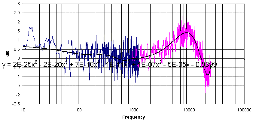
That leaves a couple of problems: The formula is partially unreadable and the coefficients don't have nearly enough decimal places to yield the proper result. To fix that, click on the chart and shrink the "Plot Area" so there is a lot of empty space on top of the chart. Then click on the formula and move it to the top where it can be seen. It will look like this:
Next, Right click on the formula. You will get a small window. Select "Format Data Labels". A larger window will appear. Select the "Number" tab. Scroll down and select "Scientific". Then increment the "Decimal places" to at least 5 or 6. Click OK and the formula coefficients will now have as many decimal places as you selected, as shown below.
You see that the formula only calls for values of X. The Y value information of the original data is embedded in the coefficients. That is why very high resolution of those numbers is important. The "E" designates scientific notation. Now, choose an area on your spreadsheet to perform the calculations. You will need three more columns than the order of the polynomial. For this 6th order polynomial I used 9 columns. For this example, let's assume you have chosen columns D through L. In the first column (D), copy & paste the whole column of X values of your data file. That will make life a little easier when you plot it later Designate the 2nd column (E) for the new Y values of the Trendline, but leave it empty for the moment. Now enter each term of the Formula into a separate cell along the row of the first line of your X data. Let's call it row 6. In the column (F) to the right of your blank Y value, type the coefficient of the 1st term of the formula and multiply it by the cell of your corresponding X value, raised to the appropriate power. Pay attention if the coefficient is negative. The 1st term (in column F), will look like this: = 1.800973E-25*D6^6 When those cells are filled, go to your blank Y column (E6) and type the formula =SUM(F6:L6). That is your Y value corresponding to the first value of X. Now select cells E through L from the row you've just completed and copy them to the bottom of your X-value data. Excel will set the correct row numbers when you copy the formulas. You are finished ! The first few rows of the calculation RESULTS will look like this:
The X & Y columns (D & E) are the values for your
Trend line. If you haven't made any mistakes and you plot them in the same chart that has the Trendline, you'll have to temporarily delete the Trendline in order to see the new data plotted under it. But save the file before you do that. Good luck ! |


The
Boston Audio Society
PO BOX 260211
Boston MA 02126
problems? email Barry: webmaster@bostonaudiosociety.org
updated 10/2/12